Ihr Warenkorb ist leer

Es ist ein Fehler aufgetreten:
ANGEBOTE & SETS
-
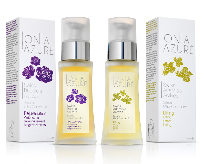
Serum-Set Hautverjüngung und Anti-Falten
99.00 statt 118.00 CHF
-
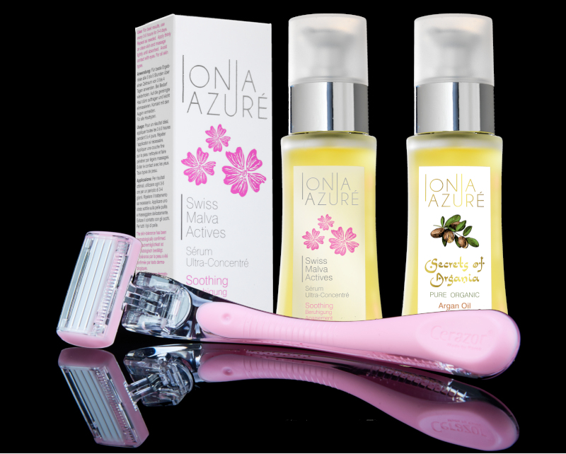
Dermaplaning Cerazor
Hautpflege-Set
89.00 statt 107.80 CHF
-
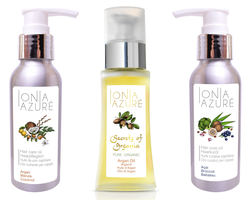
Pflege-Set fürs Haar aus 100% BIO-Haarölen
76.00 statt 90.80 CHF
HIGHLIGHTS & NEUHEITEN
-
Serum gegen Altersflecken und Pigmentflecken.
-
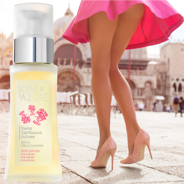
Serum gegen Cellulite. Strafft die Haut.
-
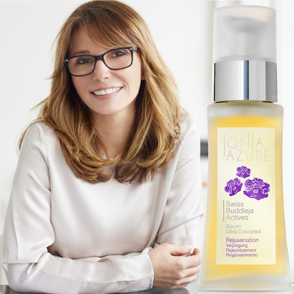
Serum gegen Hautalterung. Verjüngt die Haut.
-
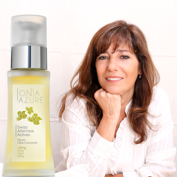
Serum gegen Falten. Glättet die Haut und verbessert die Hautfestigkeit.
-
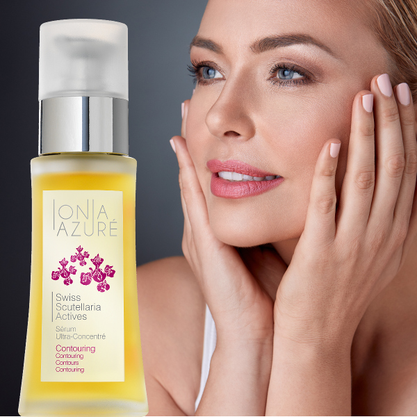
Contouring Serum gegen dunkle Augenringe. Reduziert Schwellungen.
-
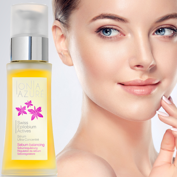
Serum gegen fettige und glänzende Haut. Wirkt reinigend und mattierend.
NEUESTE BEITRÄGE AUS DEM BEAUTY-BLOG
-
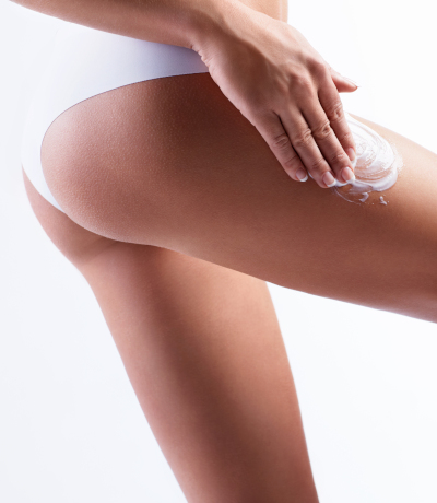
Können Kosmetika gegen Cellulite wirklich helfen? 6 Fakten.
Die Kosmetika können die Straffheit der Haut wirksam verbessern und zumindest eine milde Entwässerung...
-
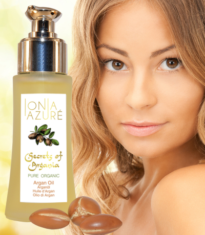
Arganöl für gesünderes und glänzenderes Haar.
Arganöl verdient es wirklich, als "flüssiges Gold" bezeichnet
zu werden, weil es mehrere positive Eigenschaften in einem Produkt vereint. Unserer Haut kann... -

Geschützt in den Winter mit Edelweiss.
Wir alle kennen es: Kaum ist der Winter da, scheint unsere Haut aus dem Gleichgewicht zu geraten: Sie fühlt sich trocken an...
PRODUKTE AUS UNSEREM SORTIMENT
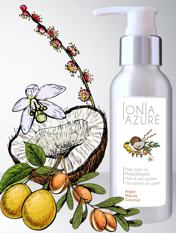
Aus 33.3% BIO-Arganöl, 33.3% BIO-Marulaöl und 33.3% BIO-Kokosöl.
CHF 35.50
Reines BIO-Arganöl, Preis inkl. Versand.
CHF 19.80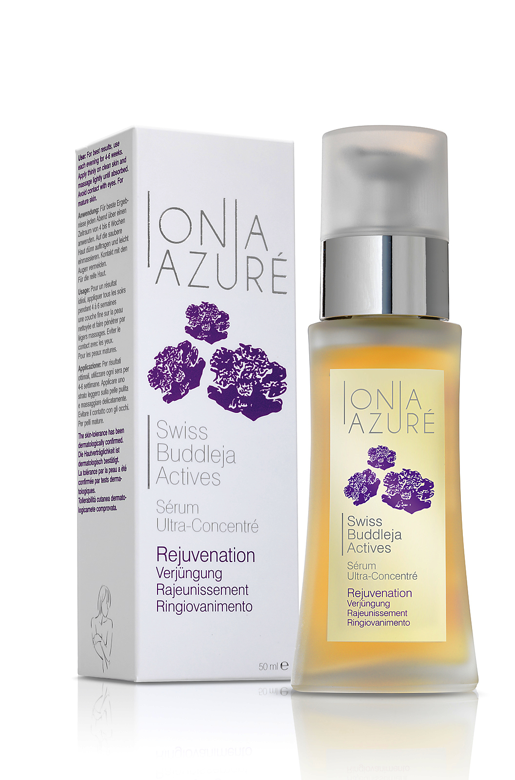
Verjüngung. Gegen Hautalterung.
CHF 59.00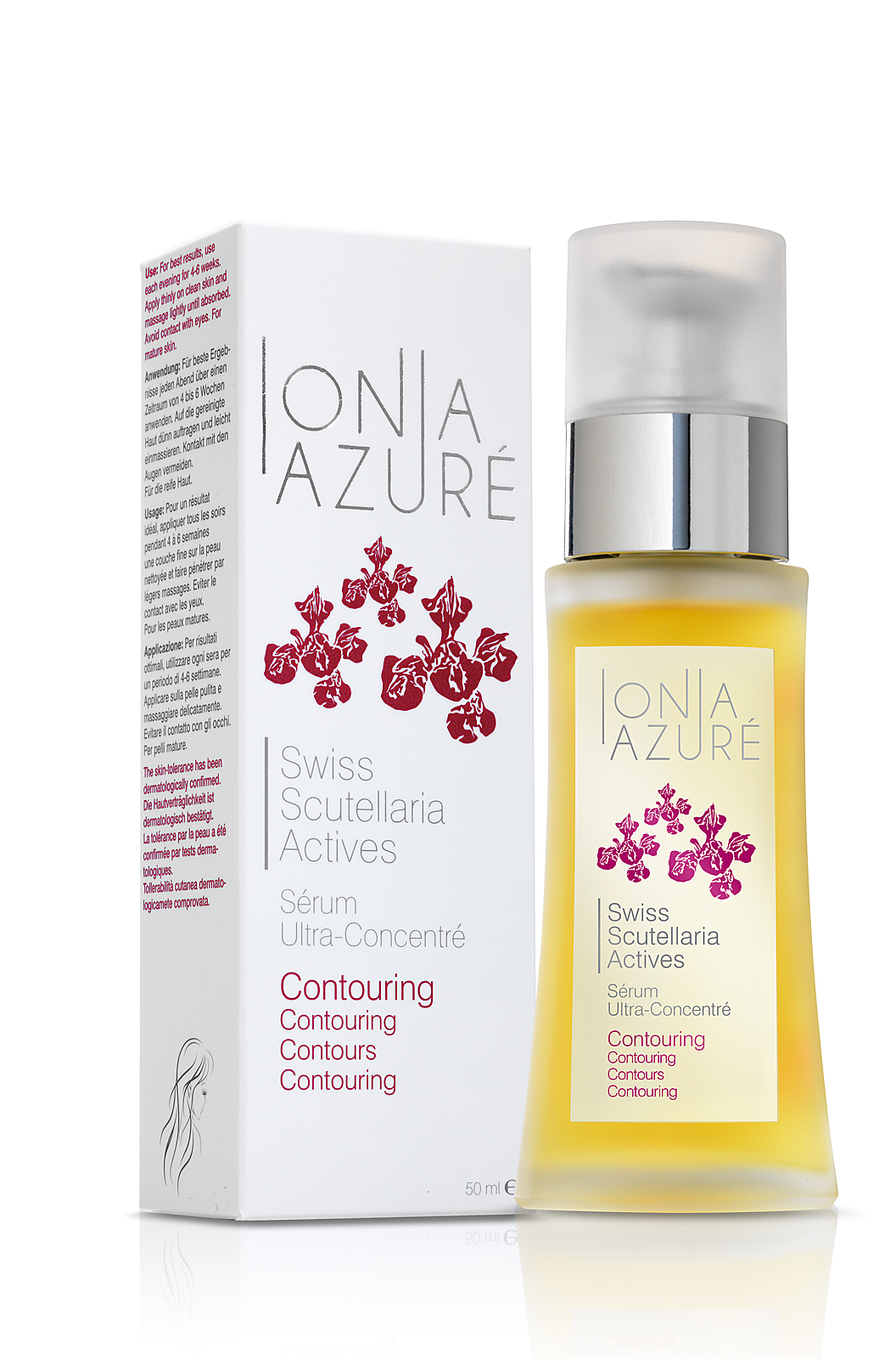
Contouring. Gegen dunkle Augenringe.
CHF 59.00